Friday, May 11, 2012

eScapegoat Mission Statement


Mission  Statement:

Objective: To provide high income clients with the benefit of no interruptions of their day to day lives; in regard to any acts that may or may not have been committed on their part that can result in harsh legal consequences.

Audience: High income & profile members of society.

Service: By utilizing our substantial network of law enforcement affiliates, we are able to manipulate aspects of cases, investigations, and evidence that would exonerate our clients of any potential crime they are accused of.

RealM


Tuesday, March 20, 2012

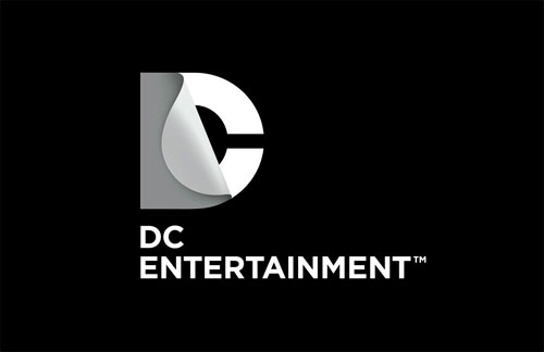
LDL: DC Entertainment Logo (Response)

http://www.logodesignlove.com/dc-entertainment-logo


I first came across this new logo while watching one of their newest series and thought to myself "what was wrong with the old one?" I didn't really get how it related to DC. After analyzing it further I discovered that the D was peeled back revealing the C. Even though it was a clever design I still failed to see any significance it it compared to it's predecessors, but after reading the above article I have a new found respect for it. DC stated that “The design of the new DC Entertainment identity uses a “peel” effect – the D is strategically placed over the C with the upper right-hand portion of the D peeling back to unveil the hidden C – symbolizing the duality of the iconic characters that are present within DC Entertainment’s portfolio.” The moment I read that I immediately was reminded of the companies biggest rivalries (Batman vs Joker, Superman vs Lex Luther etc...) The DC universe is full of heroes and villains that are polar opposites in every way, but still have some kind of unbreakable connection to each other. I see now how this logo impressively represents that. The only problem is that it's not something that is not immediately apparent to the viewer which some may find to be counter productive to the purpose of a logo.

A Makeover for the Starbucks Mermaid (Response)

http://www.nytimes.com/2011/01/09/weekinreview/09heller.htm?_r=2

As someone who infrequently visits Starbucks I never really took the time to notice their logo. It was only by reading this article that I found out that it was a mermaid that adorned the cups of the often overpriced beverages with an apple like cult following. This being said I find Mr. Heller's statement  "Fear of change may have something to do with it. Trademarks and logos are so integrally linked to our daily lives that any tinkering with the familiar is suspect — and to be avoided." to be very true. People generally do not like change. I personally fail to see a problem with the logo change. The article does a service by providing the reader with a history of all the Starbucks logos dating all the way back to 1971. That's 41 years of having their mermaid incorporated as their logo. Since the logo still retains the same color scheme, and the main focal point of logos before it I don't see any reason the more minimalist approach should not still be easily identifiable with their customers. Personally I find the logo better than it's predecessor as it gives off the vibe of a fresh start, but the real challenge will be whether the company can justify this redesign with an improvement of some sort in their actual product or service.

Monday, February 27, 2012

Movie Poster Prototype

Made a concept of my future project. Hopefully the final project will be much different. :D

Friday, February 10, 2012

Functional and Non Functional products

Functional


My idea for a functional product is a cellphone mouse that could either be made as an individual product, but more practically as a downloadable app. The app would allow for a customized layout both for cosmetic and ambidextrous use. Functions such as scrolling would be done with simple touchscreen gestures.

Non-Functional

A portable battery charger that runs off of 4 AA batteries. The batteries would constantly recharge each other in an infinite cycle.

Friday, January 20, 2012

Ice Breaker

1. Why did I take this class?
To learn how to make custom graphics for my videos, and because I am majoring in game design and development.

2. What type pf past computer experience do you have?
I have about 13 years of computer experience mostly in gaming and video editing. I also have a good grasp of computer maintenance aspects since Im pretty much my families personal tech support.

3.  Who is your favorite artist?
BossLogic
 

4.  Do you have a favorite logo or brand? Why?
No. I actually try and avoid brand loyalty in favor of a products individual style or reliability.

5. An interesting story about me would be my first trip to L.A. when I was 17. I was flown out there for a video game tournament. The tournament took place at E for All which at the time was like E3 except for the public. I met many game developers that had made my favorite titles like Halo, Call of Duty, and Street Fighter. The atmosphere was so awesome that it pretty much cemented my desire to be involved in the industry. The icing on the cake for that weekend was getting to party at the standard hotel in L.A. which is a historic club in the city, and getting 3rd and winning $500 the next day.


6. What kind of computer access do you have outside of class?
I have an Asus gaming laptop.
  • Windows Vista Home Premium (64-bit)
  • 15.6″ widescreen display with 1920 x 1080 resolution
  • Intel Core 2 Duo P7350 (2.0GHz)
  • 4GB of DDR2 RAM
  • 320GB hard drive (7200rpm)
  • NVIDIA GeForce GTX 260M GPU (1GB)